
The USPTO refused registration of a stylized and colorized "M" mark for "retail store services featuring books, printed materials, and gifts," on the ground that the mark in the application drawing (shown immediately below) is not a substantially exact representation of the mark as used in connection with the identified services, as shown by the specimens of use (shown further below). Applicant argued that the applied-for mark creates a distinctive commercial impression apart from the remainder of the word "Marissa's.'" How do you think this appeal came out? In re Cynthia Dumas, Serial No. 87345342 (August 24, 2018) [not precedential] (Opinion by Judge George C. Pologeorgis).

Trademark Rule 2.51(a) requires that the applicant submit a drawing that is "a substantially exact representation of the mark as used on or in connection with the goods and/or services." The Board has ruled that a drawing displaying only a "minor alteration" of the mark that "does not create a new and different mark creating a different commercial impression" from the matter shown in the specimens is acceptable.
Applicant described her mark as "an uppercase M incorporating an open book on its spine, with the pages pointing upward." The specimens of record are represented by the pictures below.
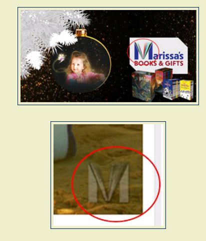
Examining Attorney Jessica Ellinger Fathy maintained that the stylized M in the first specimen shown above will not be perceived by consumers as a stand-alone mark, but instead will be viewed as the term "Marissa's." Without the letter "M" the mark would appear as the non-sensical word "arissa's." In the second specimen, the letter "M" appears alone but without any coloration, which does not match the applied-for mark, colorized mark.
The Board sided with the Examining Attorney. As to the first specimen of use, "the spacing between the stylized M and the remaining letters is equidistant so as not to engender the impression of two separate and distinct terms. Furthermore, the letters "arissa's" appear in the same color purple as the two vertical lines in the stylized letter M, reinforcing the consumer perception that Applicant's stylized M mark "is intricately interwoven with the remaining letters that comprise the word 'Marissa's.'"
Here, however, the applied-for mark is so "intricately intertwined" in the term "Marissa's " as to constitute a single composite mark.
As to the second specimen of use, the Board again agreed with the Examining Attorney. "Because the display of the stylized letter M mark alone on these specimens is not displayed in the colors claimed as a feature of the mark, these specimens are also unacceptable because they are not a substantially exact representation of the mark as displayed on the drawing."
And so the Board affirmed the refusal to register.
TTABlog comment: Is this a WYHA?
The content of this article is intended to provide a general guide to the subject matter. Specialist advice should be sought about your specific circumstances.
