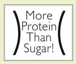
In a December 2017 decision the Board granted, in part, petitioner's motion for summary judgment [here] and ordered cancellation of a Supplemental Registration for the phrase MORE PROTEIN THAN SUGAR! in standard character form, finding that the purported mark is incapable of functioning as a trademark for "yogurt." However, as to respondent's second registration, the Board left open the question of whether the word+design version of the mark (shown below) is registrable on the Supplemental Register (with a disclaimer of the phrase). In other words, are the design elements - the font style, stacked wording, and curved lines - capable of becoming distinctive? How do you think this came out? The Icelandic Milk and Skyr Corporation v. Saga Dairy, Inc., Cancellation No. 92062423 (November 26, 2018) [not precedential] (Opinion by Judge Frances Wolfson).

In its earlier ruling, the Board found that MORE PROTEIN THAN SUGAR is commonly used to describe the nutritional content of yogurt and would be perceived as merely an informational slogan and not as a trademark. Petitioner Icelandic Milk here argued that the word+design mark is likewise incapable of serving as a source indicator because the design elements are "nothing but ordinary in nature and do[] not create a commercial impression separate and apart from the unregistrable components."
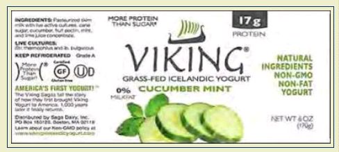
Petitioner's CEO and its CFO testified that the use of stacked text, common geometric shapes, and minimal design features is commonplace in the yogurt industry. Documentary evidence supported their testimony. Geometric shapes and lines are commonly used to emphasize or separate generic wording from the rest of the packaging. (See applicant's label, below).

Petitioner uses a sans serif font, stacked text, and lines on its packaging to separate various phrases:

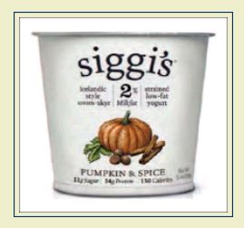
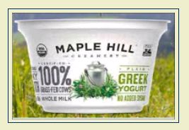
Third-parties in the yogurt industry also use lines to emphasize text. For example:

"In order for a term which is otherwise unregistrable to be capable of distinguishing the goods or services in connection with which it is used, the presentation thereof must be so striking, unique or distinctive in character as to overcome its inherent incapacity and render the mark capable of serving as an indicium of origin." In re Carolyn's Candies. Inc., 206 USPQ 356 (TTAB 1980).
Based on the record evidence, though not extensive, the Board concluded that "the use of lines, including curved lines, is an ordinary and commonplace means to separate generic text on a product label, and that the additional design features in Respondent's purported mark are not so striking, unique or distinctive as to have overcome the inherent incapacity of the mark as a whole."
And so the Board granted the petition for cancellation of the Supplemental Registration for the word+design mark.
The content of this article is intended to provide a general guide to the subject matter. Specialist advice should be sought about your specific circumstances.
