
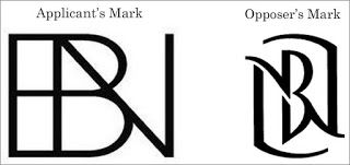
Blue Nile, Inc. opposed an application to register the mark shown below left, claiming a likelihood of confusion with its registered mark shown below right, both marks for jewelry. Applicant Brent Neale LLC described its mark as the stylized letter "B" and "N" superimposed. Opposer Blue Nile's registration did not include a description of the mark. Blue Nile contended that its mark is famous and that the letter "B" is prominently featured and eye-catching in both marks. How do you think this came out? Blue Nile, Inc. v. Brent Neale LLC, Opposition No. 91239053 (May 7, 2020) [not precedential] (Opinion by Judge Marc A. Bergsman).
Since the involved goods are the same the Board must presume that they travel through the same channels of trade to the same classes of purchasers. See, e.g., In re Viterra Inc., 671 F.3d 1358, 101 USPQ2d 1905, 1908 (Fed. Cir. 2012). Blue Nile contended that jewelry buyers are careful in their purchases, but the Board pointed out that the identifications of goods in the pleaded registration and the opposed application are not limited to expensive or designer jewelry. '[T]he applicable standard of care for a likelihood-of-confusion analysis is that of the least sophisticated consumer. See Stone Lion Capital Partners, 110 USPQ2d at 1163 (precedent requires consumer care for likelihood-of-confusion decision to be based "on the least sophisticated potential purchasers").
The Board noted the lack of evidence of actual confusion, but for this fact to be probative, there must have been a reasonable opportunity for confusion to occur. Under the seventh and eight du Pont factors - and unlike the second, third, and fourth factors - the Board must consider any evidence of actual market conditions. In re Guild Mtg. Co., 2020 USPQ2d 10279 (TTAB 2020). The goods of the parties are designer or "high quality" jewelry, and neither party displays its mark as a standalone mark (except on the jewelry itself).
[T]he parties use their respective stylized BN marks in conjunction with their Blue Nile and Brent Neale trade names. Thus, when consumers are shopping for jewelry, the parties are promoting the trade names Blue Nile and Brent Neale, and, to a lesser extent rather, the stylized BN trademarks. In this regard, when consumers are shopping via social media, they encounter the parties through the trade names, not the marks at issue in the opposition. In addition, the parties do not advertise, market or sell their jewelry through the same retailers so that it is unlikely that consumers will encounter the marks of the parties at the same time. For these reasons, we find that there has not been a reasonable opportunity for confusion to occur and, therefore, these DuPont factors are neutral.
Blue Nile's registered mark is an arbitrary designation for jewelry and therefore is inherently strong. Blue Nile claimed that its mark is famous based on use of the mark since 2012, more than $212 million in advertising, ten million website visitors annually, two million purchasers, industry awards, and media coverage. The Board, however, was not impressed.
The persuasiveness of Opposer's evidence is dramatically reduced because, with the exception of the stylized BN mark appearing on the jewelry itself, every example of Opposer's use of the stylized BN mark includes Opposer's trade name, Blue Nile.
The Board found that Blue Nile failed to proved that the stylized BN mark is famous, or even commercially strong.
Opposer has proven that it has a successful jewelry business and that it uses more than one mark. Based on the foregoing, we find that Opposer's stylized BN mark lies in the middle of the spectrum from very strong to very weak. See Joseph Phelps Vineyards, 122 USPQ2d at 1734. Nevertheless, Opposer's stylized BN mark is entitled to the broad scope of protection normally accorded an arbitrary mark.
Turning to a comparison of the marks, the Board observed once again that when the goods are identical, a lesser degree of similarity between the marks is necessary to support a finding of likelihood of confusion. Of course, the proper test is not a side-by-side comparison of the marks; instead "the proper focus is on the recollection of the average customer, who retains a general rather than specific impression of the marks."
For stylized letter marks, the Board must consider both the visual and oral impacts of the mark, not just the latter. In re Burndy Corp., 300 F.2d 938, 133 USPQ 196, 197 (CCPA 1962) (the marks, design marks based on the letter "B" have "great dissimilarities between them which can be fully appreciated only from seeing them."). The Board surveyed prior decisions in Textron Inc. v. Maquinas Agricolas "Jacto" S.A., 215 USPQ 162, 163-64 (TTAB 1982), and observed:
[H]ighly stylized, highly contrasting letter/design combinations tend to fall on the "no likelihood" side of the adjudicative balance and rather clear portrayals of the letters involved in the compared marks tend to result in "likelihood of confusion" findings.
The Board found that the letter marks at issue here "are so highly stylized that they are akin to design marks and they are not similar." It disagreed with Blue Nile's assertion that the letter "B" is prominent and eye-catching in both mark:. applicant's mark prominently features the letters "BN." In any event the marks are so highly stylized that consumers will distinguish them based on appearance.
And so the Board dismissed the opposition.
Read comments and post your comment here.
Originally published 11 May, 2020
The content of this article is intended to provide a general guide to the subject matter. Specialist advice should be sought about your specific circumstances.
